
Tutorial: build a digital products store theme
Tutorial: build a Sneferu theme for a digital products store, from a design mockup to a live Hekana store, with the Bento example theme.
On this page
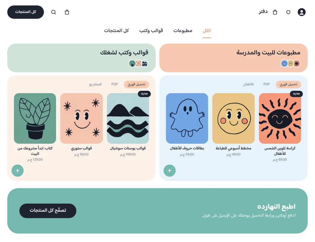
This tutorial builds Bento, a home page for a shop that sells printables,
templates and e-books as digital files, from a design mockup to a live store.
It uses only the CLI and the parts of Sneferu described in the earlier
chapters. The finished theme is live at
demo-bento.hekana.com (Arabic) and
demo-bento.hekana.com/en (English), and its
files are in the SDK repository under examples/themes/bento/.
The mockup was generated as a design brief. Its Arabic is placeholder text, and its lavender and pink tiles become sky blue and peach.
<hk-sections />
<hk-schema>
  {
    "sections": [
      {
        "type": "tabs"
      },
      {
        "type": "bento"
      },
      {
        "type": "band"
      }
    ]
  }
</hk-schema>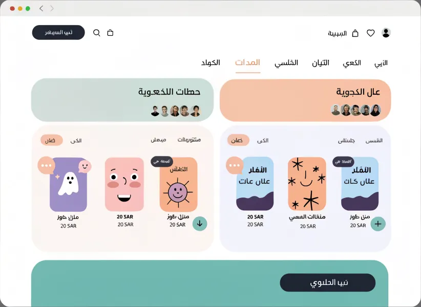
Two more themes were built the same way and follow the same steps. Each home page is a template listing its sections, like Bento's above:
| Theme | What it shows | Live |
|---|---|---|
| Creator | editorial covers in a scroll-snap row, a checklist, an author strip | demo-creator.hekana.com |
| License | dark, plan cards built from products, app cards, a FAQ accordion | demo-license.hekana.com |
<hk-sections />
<hk-schema>
  {
    "sections": [
      {
        "type": "covers"
      },
      {
        "type": "what-you-get"
      },
      {
        "type": "author"
      }
    ]
  }
</hk-schema><hk-sections />
<hk-schema>
{
"sections": [
{
"type": "plans-hero"
},
{
"type": "features"
},
{
"type": "apps"
},
{
"type": "faq"
}
]
}
</hk-schema>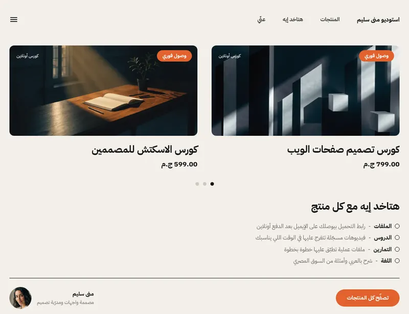
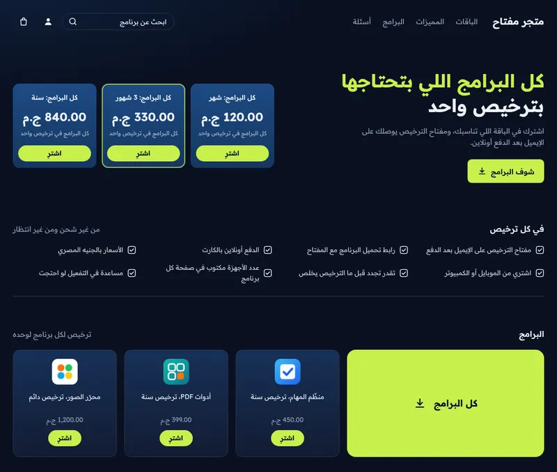
Each example folder has a README.md that walks through its own files the
same way this page walks through Bento.
1. Plan the data
Before writing a template, decide what the page reads. Bento shows two categories of products, so the store needs two product categories with fixed handles:
| Handle | Shelf |
|---|---|
printables | the first shelf |
templates | the second shelf |
A lookup takes fixed text only (collection('printables')), so these handles
are part of the theme. Everything else on the page is either a product field
(title, url, price, image) or a word from the locale files.
2. Create the theme and the sample data
npx @hekana/sneferu init bento
cd bento
Delete the starter's sections/hero.sneferu, sections/featured.sneferu and
blocks/chip.sneferu; the theme writes its own.
The dev preview's built-in sample products are game cards, and its only
collection is featured. To preview with this store's own products, write
.sneferu-dev/data.json. It can be split by locale, one block per language:
 "en": {
  "store": {
   "name": "Daftar"
  },
  "collections": {
   "printables": {
    "title": "Printables",
    "products": [
     {
      "title": "Sunny colouring book",
      "url": "/en/products/sunny-colouring-book",
      "price": 6900,
      "compare_at": null,
That is the start of the "en" block; an "ar" block before it has the same
products with Arabic titles, so ?locale=ar previews in Arabic. The folder starts with a dot, so it is never
part of the theme and never pushed. (Getting started
has the details; it needs the CLI from Sneferu main after #16.)
3. Tokens
{
  "id": "bento",
  "name": "Bento",
  "version": "1.0.0",
  "author": "Hekana",
  "description": "A soft pastel bento-grid theme for printables, templates and e-books",
  "category": "digital",
  "engine": "hk2",
  "engineCompatibility": "^2.0.0",
  "defaultLocale": "ar",
  "locales": ["ar", "en"],
  "settings": {},
  "tokens": {
    "colors": {
      "primary": "#1F2433",
      "secondary": "#74B8AE",
      "accent": "#E9946C",
      "background": "#FFFFFF",
      "text": "#1F2433",
      "muted": "#6E7383",
      "sage": "#CFE3D7",
      "peach": "#F7C9AF",
      "warm": "#FCF1EA",
      "sky": "#E8F1FA",
      "teal": "#74B8AE",
      "line": "#E8E6E1"
    },
    "layout": { "contentWidth": "1040px" }
  }
}
defaultLocale: "ar"makes/Arabic, right to left;/enis English.- Every colour the page uses is a token. The extra keys (
sage,peach,warm,sky,teal,line) become--hk-color-sageand so on. - No purple, lavender or pink anywhere: the mockup's lavender panel is
skyand its pink tile ispeach.
There is no font loader yet, so assets/fonts.css holds @font-face rules
that point at https://fonts.gstatic.com (Arabic and Latin subsets of Baloo
Bhaijaan 2), and the stylesheet sets the family on the theme's own root:
.bt {
  font-family: 'Baloo Bhaijaan 2', system-ui, sans-serif;
  background: var(--hk-color-background);
  color: var(--hk-color-text);
  line-height: 1.5;
  min-height: 100vh;
}
4. Layout
<div class="bt">
  <header class="bt-header">
    <div class="bt-wrap bt-header-row">
      <div class="bt-start">
        <a
          class="bt-icon bt-user"
          href="{{ t('href_account') }}"
          aria-label="{{ t('account') }}"
        >{% render 'icon', name: 'user' %}</a>
        <a
          class="bt-icon bt-hide-phone"
          href="{{ t('href_wishlist') }}"
          aria-label="{{ t('wishlist') }}"
        >{% render 'icon', name: 'heart' %}</a>
        <a
          class="bt-icon bt-hide-phone"
          href="{{ t('href_cart') }}"
          aria-label="{{ t('cart') }}"
        >{% render 'icon', name: 'bag' %}</a>
        <a class="bt-logo" href="{{ store.url }}">{{ store.name }}</a>
      </div>
      <div class="bt-end">
        <a
          class="bt-icon bt-hide-phone"
          href="{{ t('href_cart') }}"
          aria-label="{{ t('cart') }}"
        >{% render 'icon', name: 'bag' %}</a>
        <a
          class="bt-icon bt-hide-phone"
          href="{{ t('href_search') }}"
          aria-label="{{ t('search') }}"
        >{% render 'icon', name: 'search' %}</a>
        <a class="bt-pill" href="{{ t('href_products') }}">{{ t('all_products') }}</a>
        <details class="bt-menu">
          <summary class="bt-icon" aria-label="{{ t('menu') }}">
            {% render 'icon', name: 'menu' %}
          </summary>
          <div class="bt-menu-panel">
            <a href="{{ t('href_search') }}">{{ t('search') }}</a>
            <a href="{{ t('href_cart') }}">{{ t('cart') }}</a>
            <a href="{{ t('href_wishlist') }}">{{ t('wishlist') }}</a>
            <a href="{{ t('href_other_locale') }}">{{ t('other_locale') }}</a>
          </div>
        </details>
      </div>
    </div>
  </header>
  <main><hk-slot name="content" /></main>
  <footer class="bt-footer">
    <div class="bt-wrap bt-footer-row">
      <p class="bt-footer-name">{{ store.name }}</p>
      <p class="bt-footer-note">{{ t('footer_note') }}</p>
      <a href="{{ t('href_other_locale') }}">{{ t('other_locale') }}</a>
    </div>
  </footer>
</div>- The page goes where
<hk-slot name="content" />is. - All words are
t('…'). Links that must keep the current language take their URL from the locale files too:t('href_cart')is/cartinar.jsonand/en/cartinen.json. - The phone menu is
<details>/<summary>: it opens without script. - Icons are inline SVG in
snippets/icon.sneferu, picked with{% render 'icon', name: 'bag' %}.
5. The template
The template is the one shown at the top of this page: three sections, in order. A merchant can reorder them or add more in the builder.
6. The shelves
This is the heart of the page: one section that renders the same snippet twice, with a different collection and different colours each time.
<section class="bt-bento" id="shop">
  <div class="bt-wrap bt-bento-grid">
    {% render 'shelf', c: collection('printables'), key: 'printables', title: t('printables_title'), note: t('printables_note'), href: t('href_printables'), head: 'peach', panel: 'sky' %}
    {% render 'shelf', c: collection('templates'), key: 'templates', title: t('templates_title'), note: t('templates_note'), href: t('href_templates'), head: 'sage', panel: 'warm' %}
  </div>
</section>
<hk-schema>
  {
    "name": "Bento shelves",
    "version": 1,
    "settings": {}
  }
</hk-schema><div class="bt-shelf" id="{{ key }}">
<a class="bt-head" data-tone="{{ head }}" href="{{ href }}">
<h2>{{ title }}</h2>
<span class="bt-thumbs" aria-hidden="true">
{% for p in c.products limit: 5 %}
{% if p.image %}<img src="{{ p.image.url }}" alt="" width="28" height="28" loading="lazy" />{% endif %}
{% endfor %}
</span>
</a>
<div class="bt-panel" data-tone="{{ panel }}">
<div class="bt-chips">
<span class="bt-chip bt-chip-on">{{ t('chip_instant') }}</span>
<span class="bt-chip">{{ t('chip_pdf') }}</span>
<span class="bt-chip">{{ note }}</span>
</div>
{% if c.products %}
<div class="bt-covers">
{% for p in c.products limit: 3 %}
<div class="bt-cover">
<hk-product-card product="{{ p }}" class="bt-card" />
{% if forloop.first %}<span class="bt-new">{{ t('badge_new') }}</span>{% endif %}
</div>
{% endfor %}
</div>
{% else %}
<p class="bt-empty">{{ t('empty') }}</p>
{% endif %}
<a
class="bt-more"
href="{{ href }}"
aria-label="{{ t('see_all') }}: {{ title }}"
>{% render 'icon', name: 'plus' %}</a>
</div>
</div>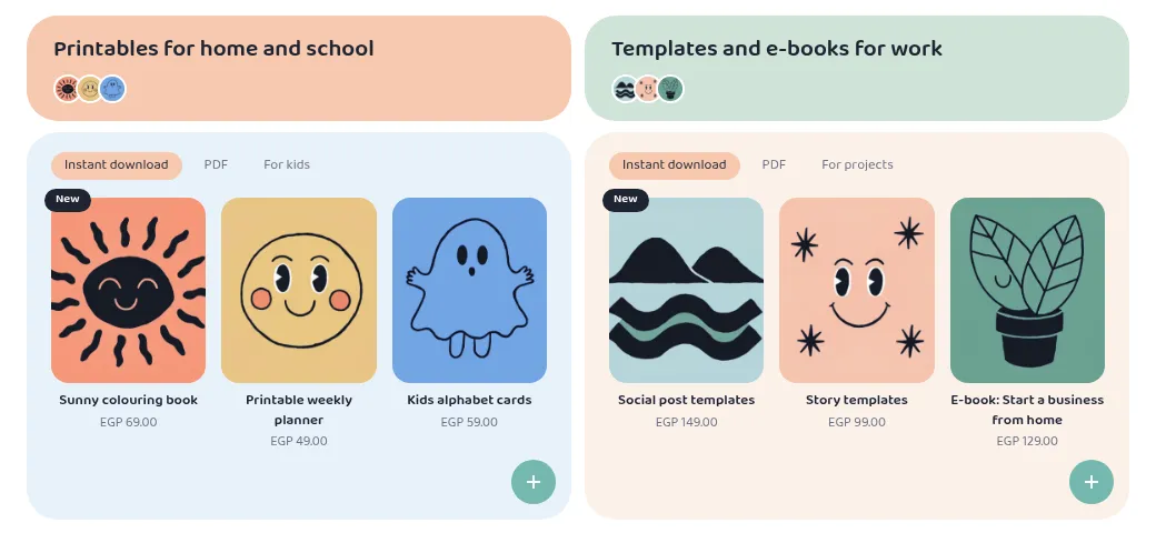
How it works
{% render 'shelf', c: collection('printables'), … %}passes the whole collection asc. The snippet only readsc.products, so it works for any collection.data-tone="{{ head }}"writespeach,sage,skyorwarm. A template cannot build astyle="…"from data (SN2009), so the colour comes from one CSS rule per tone:[data-tone="peach"] { background: var(--hk-color-peach); }.{% for p in c.products limit: 5 %}draws the round thumbnails in the header tile.{% if c.products %}is false for an empty collection: the panel then shows one line of text instead of an empty grid.<hk-product-card product="{{ p }}" class="bt-card" />renders the cover, the title and the price as one link. The card has no slot for a badge, so the "New" badge is a sibling, placed over the image by CSS, and only onforloop.first.
The grid and the covers:
/* Bento shelves: a header tile over a panel, two side by side */
.bt-bento { padding-block: 0 24px; }
.bt-bento-grid { display: grid; grid-template-columns: 1fr 1fr; gap: 12px; }
.bt-shelf { display: flex; flex-direction: column; gap: 10px; }
.bt-head {
  display: flex; flex-direction: column; align-items: flex-start; gap: 8px; padding: 18px 24px 16px;
  border-radius: 28px; min-height: 84px;
}
.bt-head h2 { margin: 0; font-size: 21px; font-weight: 600; line-height: 1.3; }
.bt-thumbs { display: flex; }
.bt-thumbs img { width: 26px; height: 26px; border-radius: 50%; object-fit: cover; border: 2px solid #FFFFFF; margin-inline-end: -6px; }
.bt-panel { position: relative; padding: 18px 22px 60px; border-radius: 28px; }
.bt-chips { display: flex; gap: 8px; flex-wrap: wrap; margin-bottom: 16px; }
.bt-chip { font-size: 12.5px; padding: 3px 12px; border-radius: 999px; color: var(--hk-color-muted); }
.bt-chip-on { background: var(--hk-color-peach); color: var(--hk-color-text); }
.bt-covers { display: grid; grid-template-columns: repeat(3, 1fr); gap: 14px; }
.bt-cover { position: relative; }
.bt-card { display: flex; flex-direction: column; align-items: center; text-align: center; gap: 2px; }
.bt-card img { width: 100%; aspect-ratio: 5 / 6; object-fit: cover; border-radius: 16px; display: block; margin-bottom: 6px; }
7. The band
<section class="bt-band-wrap">
  <div class="bt-wrap">
    <div class="bt-band">
      <div>
        <h2>{{ section.settings.heading | default: t('band_heading') }}</h2>
        <p>{{ section.settings.text | default: t('band_text') }}</p>
      </div>
      <hk-button
        label="{{ section.settings.button | default: t('band_button') }}"
        href="{{ t('href_products') }}"
        class="bt-band-button"
      />
    </div>
  </div>
</section>
<hk-schema>
  {
    "name": "Call to action band",
    "version": 1,
    "settings": {
      "heading": {
        "type": "text",
        "label": "Heading (empty: the theme's own words)",
        "default": "",
        "maxLength": 80
      },
      "text": {
        "type": "textarea",
        "label": "Text",
        "default": "",
        "maxLength": 200
      },
      "button": {
        "type": "text",
        "label": "Button",
        "default": "",
        "maxLength": 30
      }
    }
  }
</hk-schema>
A setting holds one value for every language. So each setting defaults to an
empty string, and the template prints
{{ section.settings.heading | default: t('band_heading') }}: until the
merchant types a heading, the page shows the locale text in its own language.
hk-button renders <a class="sn-btn sn-btn-solid"> with no visual style of
its own; the theme styles it through the class it passes (bt-band-button).
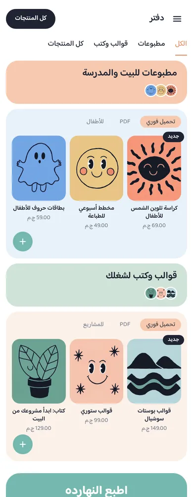
8. Phones
One media query at 639 px, the width the mobile- props use, stacks the
shelves and rearranges the header:
@media (max-width: 639px) {
  .bt-wrap { padding-inline: 12px; }
  .bt-hide-phone { display: none; }
  .bt-menu { display: block; }
  .bt-header-row { justify-content: flex-start; gap: 6px; }
  .bt-start, .bt-end { display: contents; }
  .bt-menu { order: -1; }
  .bt-logo { margin: 0; }
  .bt-pill { margin-inline: auto 0; min-height: 40px; padding-inline: 18px; font-size: 13px; }
  .bt-user { display: none; }
  .bt-tabs { padding-block: 4px 10px; }
  .bt-tabs-row { justify-content: flex-start; gap: 20px; }
  .bt-tabs-row a { font-size: 15px; }
  .bt-bento-grid { grid-template-columns: 1fr; gap: 10px; }
  .bt-head { border-radius: 24px; padding: 14px 20px; min-height: 76px; }
  .bt-head h2 { font-size: 19px; }
  .bt-panel { padding: 14px 12px 56px; border-radius: 24px; }
  .bt-covers { gap: 8px; }
  .bt-card .sn-title { font-size: 12px; }
  .bt-band { border-radius: 28px; padding: 22px; justify-content: center; text-align: center; }
  .bt-band-button.sn-btn { width: 100%; }
9. Check, preview and push
npx @hekana/sneferu formatindents every file.npx @hekana/sneferu validateprints✔ theme [email protected] is valid.npx @hekana/sneferu devand openhttp://127.0.0.1:4100, then?locale=en. Narrow the window below 640 px.- Change
idintheme.jsonto a slug of your own, thennpx @hekana/sneferu push . --package <your-slug> --dev-store. - On a real store, create the two categories with the handles from step 1.
Only the home page is rendered by the theme in this release; product, category and cart pages use the store's regular theme.
What to know before you build your own
| Limit | What the three themes do |
|---|---|
asset_url() is empty on the live storefront for now | no bundled images: art comes from products, inline SVG, or an image setting with an https:// default |
| no font loader | @font-face rules pointing at https://fonts.gstatic.com |
| a lookup takes fixed text | category handles are written in the templates |
| one value per setting for every language | settings default to "", with default: t('…') |
| template default sections cannot carry blocks | list sections render items from the locale files until the merchant adds blocks |
| no form inputs | the search box is a link to the store's search page |
money always prints two decimals | prices show as EGP 69.00 |