
Tutorial: build a gaming store theme
Tutorial: build a Sneferu theme for a gaming top-up and gift-card store, from a design mockup to a live Hekana store, with the Arcade example theme.
On this page
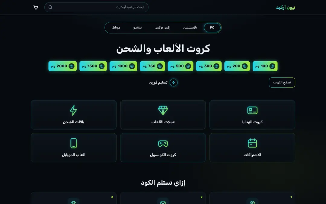
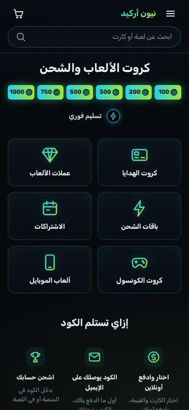
This tutorial builds Arcade, the home page of a shop that sells game gift
cards, in-game currency and top-up packs as codes, from a design mockup to a
live store. It uses only the CLI and the parts of Sneferu described in the
earlier chapters. The finished theme is live at
demo-arcade.hekana.com (Arabic) and
demo-arcade.hekana.com/en (English), and
its files are in the SDK repository under examples/themes/arcade/, with a
longer walkthrough in its README.md.
The mockup was generated as a design brief. Its Arabic is placeholder text, its prices were in dollars, and its cyan-to-magenta glow becomes cyan-to-lime.
<hk-sections />
<hk-schema>
  {
    "sections": [
      {
        "type": "arcade-hero"
      },
      {
        "type": "arcade-categories"
      },
      {
        "type": "arcade-steps"
      },
      {
        "type": "arcade-products"
      },
      {
        "type": "arcade-faq"
      }
    ]
  }
</hk-schema>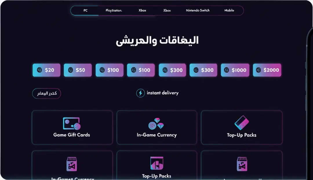
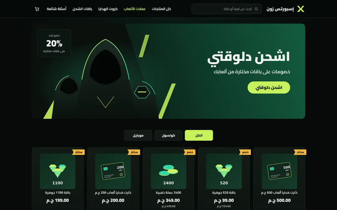
Two more gaming themes were built the same way:
| Theme | What it shows | Live | Files |
|---|---|---|---|
| Console | white and royal blue, a product carousel, an amount selector, platform icons | demo-console.hekana.com | examples/themes/console/ |
| Esports | black and deep green, a slanted hero with SVG art, top-up cards with ribbons | demo-esports.hekana.com | examples/themes/esports/ |
<hk-sections />
<hk-schema>
  {
    "sections": [
      {
        "type": "console-showcase"
      },
      {
        "type": "console-amounts"
      },
      {
        "type": "console-platforms"
      },
      {
        "type": "console-trust"
      },
      {
        "type": "console-products"
      },
      {
        "type": "console-faq"
      }
    ]
  }
</hk-schema><hk-sections />
<hk-schema>
{
"sections": [
{
"type": "esports-hero"
},
{
"type": "esports-products"
},
{
"type": "esports-steps"
},
{
"type": "esports-faq"
}
]
}
</hk-schema>
1. Create the theme
npx @hekana/sneferu init arcade, thencd arcade.- Delete
sections/hero.sneferu,sections/featured.sneferuandblocks/. - Keep
npx @hekana/sneferu devrunning in a second terminal and openhttp://127.0.0.1:4100(Arabic is the default locale once step 2 below is done; add?locale=enfor English).
The store needs products and four categories with these handles:
gift-cards, game-currency, top-ups, subscriptions.
2. Tokens
{
  "id": "arcade",
  "name": "Arcade",
  "version": "1.0.1",
  "author": "Hekana",
  "description": "A dark gaming store for gift cards and top-ups: neon cyan and lime, amount chips, category tiles, redeem steps.",
  "category": "gaming",
  "engine": "hk2",
  "engineCompatibility": "^2.0.0",
  "defaultLocale": "ar",
  "locales": ["ar", "en"],
  "settings": {},
  "tokens": {
    "colors": {
      "primary": "#22D3EE",
      "secondary": "#0D141C",
      "accent": "#A3E635",
      "background": "#070A0F",
      "text": "#E6EDF3",
      "muted": "#8B98A9",
      "surface": "#0C1219",
      "line": "#1C2A36"
    },
    "layout": { "contentWidth": "1200px" }
  }
}
defaultLocale: "ar"makes/Arabic, right to left;/enis English.primaryis the cyan andaccentthe lime. Extra keys (muted,surface,line) become--hk-color-mutedand so on.- The stylesheet builds its one gradient from the two tokens:
/* Arcade: near-black ground, neon cyan + lime. Colours come from theme.json tokens. */
[data-hk-theme='arcade'] {
  --arc-cyan: var(--hk-color-primary);
  --arc-lime: var(--hk-color-accent);
  --arc-grad: linear-gradient(90deg, var(--arc-cyan), var(--arc-lime));
  --arc-glow: 0 0 0 1px rgba(34, 211, 238, 0.35), 0 0 18px rgba(34, 211, 238, 0.18);
  min-height: 100vh;
  font-family: 'Rubik', system-ui, sans-serif;
  line-height: 1.6;
  background:
    radial-gradient(900px 420px at 50% -120px, rgba(34, 211, 238, 0.12), transparent 70%),
    radial-gradient(700px 360px at 85% 30%, rgba(163, 230, 53, 0.06), transparent 70%),
    var(--hk-color-background);
}
:where([data-hk-theme='arcade'] a) { color: inherit; text-decoration: none; }
:where([data-hk-theme='arcade'] h1, [data-hk-theme='arcade'] h2, [data-hk-theme='arcade'] p) { margin: 0; }
.arc-defs { position: absolute; width: 0; height: 0; overflow: hidden; }
.ic { width: 24px; height: 24px; flex: none; }
:where(…) keeps the link and heading resets at zero specificity, so a single
class such as .arc-chip can still set its own colour.
3. Words and links in the locale files
A section setting has one value for every language, so the theme keeps its
words in locales/ar.json and locales/en.json and gives text settings an
empty default. Internal links live there too: a plain href="/products" would
send an English shopper to the Arabic page.
{
  "url_prefix": "/en",
  "url_home": "/en",
  "url_products": "/en/products",
  "url_search": "/en/search",
  "hero_title": "Game cards and top-ups",
  "egp": "EGP"
}
locales/ar.json has the same keys, with url_prefix empty, the paths
without /en, and the words in Egyptian Arabic.
In a template: href="{{ t('url_products') }}", and
{{ section.settings.title | default: t('hero_title') }} for text a merchant
may override.
4. Header and footer
<svg class="arc-defs" width="0" height="0" aria-hidden="true">
  <defs>
    <linearGradient id="arc-grad" x1="2" y1="2" x2="22" y2="22" gradientUnits="userSpaceOnUse">
      <stop offset="0" stop-color="#22D3EE" />
      <stop offset="1" stop-color="#A3E635" />
    </linearGradient>
  </defs>
</svg>
<header class="arc-header">
  <hk-container>
    <div class="arc-bar">
      <details class="arc-menu">
        <summary aria-label="{{ t('menu') }}">
          {% render 'icon', name: 'menu' %}
        </summary>
        <nav class="arc-menu-panel">
          <a href="{{ t('url_home') }}">{{ t('nav_home') }}</a>
          <a href="{{ t('url_products') }}">{{ t('nav_all') }}</a>
          <a href="{{ t('url_prefix') }}/category/gift-cards">{{ t('cat_gift_cards') }}</a>
          <a href="{{ t('url_prefix') }}/category/game-currency">{{ t('cat_currency') }}</a>
          <a href="#faq">{{ t('nav_faq') }}</a>
        </nav>
      </details>
      <a class="arc-logo" href="{{ t('url_home') }}">{{ store.name }}</a>
      <a class="arc-search" href="{{ t('url_search') }}">
        <span>{{ t('search_placeholder') }}</span>
        {% render 'icon', name: 'search' %}
      </a>
      <a class="arc-cart" href="{{ t('url_cart') }}" aria-label="{{ t('cart') }}">{% render 'icon', name: 'cart' %}</a>
    </div>
  </hk-container>
</header>
<main class="arc-main"><hk-slot name="content" /></main>
<footer class="arc-footer">
  <hk-container>
    <div class="arc-footer-grid">
      <div class="arc-footer-brand">
        <span class="arc-logo">{{ store.name }}</span>
        <p>{{ t('footer_about') }}</p>
      </div>
      <nav class="arc-footer-links" aria-label="{{ t('footer_links') }}">
        <a href="{{ t('url_products') }}">{{ t('nav_all') }}</a>
        <a href="{{ t('url_prefix') }}/category/gift-cards">{{ t('cat_gift_cards') }}</a>
        <a href="{{ t('url_prefix') }}/category/game-currency">{{ t('cat_currency') }}</a>
        <a href="{{ t('url_prefix') }}/category/top-ups">{{ t('cat_topups') }}</a>
        <a href="#faq">{{ t('nav_faq') }}</a>
      </nav>
    </div>
    <p class="arc-copy">© {{ store.name }}</p>
  </hk-container>
</footer>
- The
<svg class="arc-defs">at the top declares one gradient,arc-grad, that every tile icon reuses through CSS. <details>and<summary>are the phone menu: it opens with no JavaScript. CSS shows it only under 640 px.- The search field is a link to the store's search page; themes have no form inputs.
{% render 'icon', name: 'cart' %}draws an icon fromsnippets/icon.sneferu, a set of inline SVG icons on a 24 px grid picked by name.
5. Hero: tabs, title and amount chips
<hk-section padding-y="32" mobile-padding-y="16" class="arc-hero">
  <nav class="arc-tabs" aria-label="{{ t('platforms') }}">
    <a class="arc-tab is-active" href="{{ t('url_products') }}">{{ section.settings.tab_1 | default: t('tab_1') }}</a>
    <a
      class="arc-tab"
      href="{{ t('url_prefix') }}/category/gift-cards"
    >{{ section.settings.tab_2 | default: t('tab_2') }}</a>
    <a
      class="arc-tab"
      href="{{ t('url_prefix') }}/category/gift-cards"
    >{{ section.settings.tab_3 | default: t('tab_3') }}</a>
    <a
      class="arc-tab"
      href="{{ t('url_prefix') }}/category/gift-cards"
    >{{ section.settings.tab_4 | default: t('tab_4') }}</a>
    <a
      class="arc-tab"
      href="{{ t('url_prefix') }}/category/top-ups"
    >{{ section.settings.tab_5 | default: t('tab_5') }}</a>
  </nav>
  <hk-stack gap="28" mobile-gap="20" align="center">
    <hk-heading
      text="{{ section.settings.title | default: t('hero_title') }}"
      level="h1"
      size="44"
      tablet-size="36"
      mobile-size="24"
      align="center"
      class="arc-title"
    />
    <div class="arc-chips">
      {% render 'chip', amount: section.settings.amount_1 %}
      {% render 'chip', amount: section.settings.amount_2 %}
      {% render 'chip', amount: section.settings.amount_3 %}
      {% render 'chip', amount: section.settings.amount_4 %}
      {% render 'chip', amount: section.settings.amount_5 %}
      {% render 'chip', amount: section.settings.amount_6 %}
      {% render 'chip', amount: section.settings.amount_7 %}
      {% render 'chip', amount: section.settings.amount_8 %}
    </div>
    <div class="arc-actions">
      <hk-button
        label="{{ t('browse_cards') }}"
        href="{{ t('url_prefix') }}/category/gift-cards"
        variant="outline"
        size="sm"
        class="arc-browse"
      />
      <span class="arc-instant">
        <span class="arc-instant-icon">{% render 'icon', name: 'bolt' %}</span>
        {{ t('instant_delivery') }}
      </span>
    </div>
  </hk-stack>
</hk-section>
<hk-schema>
  {
    "name": "Arcade hero",
    "version": 1,
    "settings": {
      "title": {
        "type": "text",
        "label": "Title (empty = theme text)",
        "default": "",
        "maxLength": 80
      },
      "tab_1": {
        "type": "text",
        "label": "Tab 1",
        "default": "",
        "maxLength": 24
      },
      "tab_2": {
        "type": "text",
        "label": "Tab 2",
        "default": "",
        "maxLength": 24
      },
      "tab_3": {
        "type": "text",
        "label": "Tab 3",
        "default": "",
        "maxLength": 24
      },
      "tab_4": {
        "type": "text",
        "label": "Tab 4",
        "default": "",
        "maxLength": 24
      },
      "tab_5": {
        "type": "text",
        "label": "Tab 5",
        "default": "",
        "maxLength": 24
      },
      "amount_1": {
        "type": "number",
        "label": "Amount 1 (EGP)",
        "default": 100,
        "min": 0,
        "max": 100000
      },
      "amount_2": {
        "type": "number",
        "label": "Amount 2 (EGP)",
        "default": 200,
        "min": 0,
        "max": 100000
      },
      "amount_3": {
        "type": "number",
        "label": "Amount 3 (EGP)",
        "default": 300,
        "min": 0,
        "max": 100000
      },
      "amount_4": {
        "type": "number",
        "label": "Amount 4 (EGP)",
        "default": 500,
        "min": 0,
        "max": 100000
      },
      "amount_5": {
        "type": "number",
        "label": "Amount 5 (EGP)",
        "default": 750,
        "min": 0,
        "max": 100000
      },
      "amount_6": {
        "type": "number",
        "label": "Amount 6 (EGP)",
        "default": 1000,
        "min": 0,
        "max": 100000
      },
      "amount_7": {
        "type": "number",
        "label": "Amount 7 (EGP)",
        "default": 1500,
        "min": 0,
        "max": 100000
      },
      "amount_8": {
        "type": "number",
        "label": "Amount 8 (EGP)",
        "default": 2000,
        "min": 0,
        "max": 100000
      }
    }
  }
</hk-schema>{% if amount %}
<a class="arc-chip" href="{{ t('url_search') }}">
<span class="arc-chip-icon">{% render 'icon', name: 'coin' %}</span>
<span class="arc-chip-amount">{{ amount }}</span>
<span class="arc-chip-cur">{{ t('egp') }}</span>
</a>
{% endif %}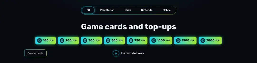
- The tabs are plain links; the first carries
is-activefor the glow. - Template default sections cannot carry blocks, so the eight amounts are
eight
numbersettings. A fresh install shows all eight; the chip snippet skips an amount set to0. moneyformats prices in piastres. These amounts are whole pounds, so the chip prints the number andt('egp').- The
hk-buttongetsclass="arc-browse", and the stylesheet draws its gradient border.
/* Hero: platform tabs, title, amount chips */
.arc-tabs { display: flex; justify-content: center; gap: 4px; width: fit-content; max-width: 100%; margin: 0 auto 40px; padding: 4px; border-radius: 999px; border: 1px solid transparent; background: linear-gradient(var(--hk-color-background), var(--hk-color-background)) padding-box, linear-gradient(90deg, rgba(34, 211, 238, 0.7), rgba(163, 230, 53, 0.55)) border-box; overflow-x: auto; scrollbar-width: none; }
.arc-tab { display: inline-flex; align-items: center; min-height: 40px; padding-inline: 26px; border-radius: 999px; font-size: 14px; font-weight: 500; color: var(--hk-color-text); white-space: nowrap; border: 1px solid transparent; }
.arc-tab:hover { color: var(--arc-cyan); }
.arc-tab.is-active { border-color: var(--arc-cyan); box-shadow: 0 0 14px rgba(34, 211, 238, 0.45), inset 0 0 10px rgba(34, 211, 238, 0.15); }
.arc-title { font-weight: 700; letter-spacing: 0; }
.arc-chips { display: flex; flex-wrap: wrap; justify-content: center; gap: 12px; }
@media (min-width: 1024px) { .arc-chips { flex-wrap: nowrap; } }
.arc-chip { display: inline-flex; align-items: center; gap: 6px; min-height: 44px; padding-inline: 10px 12px; border-radius: 8px; background: var(--arc-grad); color: #04131A; font-weight: 700; font-size: 17px; white-space: nowrap; box-shadow: 0 0 16px rgba(34, 211, 238, 0.35), 0 0 22px rgba(163, 230, 53, 0.18); transition: transform 0.15s, box-shadow 0.15s; }
.arc-chip:hover { transform: translateY(-2px); box-shadow: 0 0 22px rgba(34, 211, 238, 0.55), 0 0 30px rgba(163, 230, 53, 0.3); }
.arc-chip-icon { display: inline-flex; width: 26px; height: 26px; align-items: center; justify-content: center; border-radius: 50%; background: rgba(4, 19, 26, 0.85); color: var(--arc-cyan); }
.arc-chip-icon .ic { width: 18px; height: 18px; }
.arc-chip-cur { font-size: 11px; font-weight: 600; }
.arc-actions { width: 100%; display: grid; grid-template-columns: 1fr auto 1fr; align-items: center; gap: 16px; }
.arc-browse { justify-self: start; }
.sn-btn.arc-browse { display: inline-flex; align-items: center; line-height: 1; min-height: 44px; padding-inline: 18px; border-radius: 12px; border: 1px solid transparent; font-size: 14px; color: var(--hk-color-text); background: linear-gradient(var(--hk-color-background), var(--hk-color-background)) padding-box, linear-gradient(90deg, var(--arc-cyan), var(--arc-lime)) border-box; }
.arc-instant { display: inline-flex; align-items: center; gap: 10px; font-weight: 500; font-size: 17px; }
.arc-instant-icon { display: inline-flex; width: 34px; height: 34px; align-items: center; justify-content: center; border-radius: 50%; border: 1.5px solid var(--arc-cyan); color: var(--arc-cyan); box-shadow: 0 0 12px rgba(34, 211, 238, 0.4); }
.arc-instant-icon .ic { width: 18px; height: 18px; }
6. Category tiles
<hk-section padding-y="24" mobile-padding-y="16" class="arc-cats">
  {% if section.settings.heading %}
    <hk-heading text="{{ section.settings.heading }}" level="h2" size="24" mobile-size="20" class="arc-h2" />
  {% endif %}
  <hk-grid columns="3" mobile-columns="2" gap="16" mobile-gap="12">
    {% render 'tile', icon: section.settings.icon_1, handle: section.settings.handle_1, title: section.settings.title_1 | default: t('cat_gift_cards') %}
    {% render 'tile', icon: section.settings.icon_2, handle: section.settings.handle_2, title: section.settings.title_2 | default: t('cat_currency') %}
    {% render 'tile', icon: section.settings.icon_3, handle: section.settings.handle_3, title: section.settings.title_3 | default: t('cat_topups') %}
    {% render 'tile', icon: section.settings.icon_4, handle: section.settings.handle_4, title: section.settings.title_4 | default: t('cat_subscriptions') %}
    {% render 'tile', icon: section.settings.icon_5, handle: section.settings.handle_5, title: section.settings.title_5 | default: t('cat_console') %}
    {% render 'tile', icon: section.settings.icon_6, handle: section.settings.handle_6, title: section.settings.title_6 | default: t('cat_mobile') %}
  </hk-grid>
</hk-section>
<hk-schema>
  {
    "name": "Category tiles",
    "version": 1,
    "settings": {
      "heading": {
        "type": "text",
        "label": "Heading (optional)",
        "default": "",
        "maxLength": 60
      },
      "title_1": {
        "type": "text",
        "label": "Tile 1 title",
        "default": "",
        "maxLength": 32
      },
      "handle_1": {
        "type": "text",
        "label": "Tile 1 category handle",
        "default": "gift-cards",
        "maxLength": 60
      },
      "icon_1": {
        "type": "select",
        "label": "Tile 1 icon",
        "options": ["card", "coins", "gem", "bolt", "gamepad", "calendar", "phone", "trophy"],
        "default": "card"
      },
      "title_2": {
        "type": "text",
        "label": "Tile 2 title",
        "default": "",
        "maxLength": 32
      },
      "handle_2": {
        "type": "text",
        "label": "Tile 2 category handle",
        "default": "game-currency",
        "maxLength": 60
      },
      "icon_2": {
        "type": "select",
        "label": "Tile 2 icon",
        "options": ["card", "coins", "gem", "bolt", "gamepad", "calendar", "phone", "trophy"],
        "default": "gem"
      },
      "title_3": {
        "type": "text",
        "label": "Tile 3 title",
        "default": "",
        "maxLength": 32
      },
      "handle_3": {
        "type": "text",
        "label": "Tile 3 category handle",
        "default": "top-ups",
        "maxLength": 60
      },
      "icon_3": {
        "type": "select",
        "label": "Tile 3 icon",
        "options": ["card", "coins", "gem", "bolt", "gamepad", "calendar", "phone", "trophy"],
        "default": "bolt"
      },
      "title_4": {
        "type": "text",
        "label": "Tile 4 title",
        "default": "",
        "maxLength": 32
      },
      "handle_4": {
        "type": "text",
        "label": "Tile 4 category handle",
        "default": "subscriptions",
        "maxLength": 60
      },
      "icon_4": {
        "type": "select",
        "label": "Tile 4 icon",
        "options": ["card", "coins", "gem", "bolt", "gamepad", "calendar", "phone", "trophy"],
        "default": "calendar"
      },
      "title_5": {
        "type": "text",
        "label": "Tile 5 title",
        "default": "",
        "maxLength": 32
      },
      "handle_5": {
        "type": "text",
        "label": "Tile 5 category handle",
        "default": "gift-cards",
        "maxLength": 60
      },
      "icon_5": {
        "type": "select",
        "label": "Tile 5 icon",
        "options": ["card", "coins", "gem", "bolt", "gamepad", "calendar", "phone", "trophy"],
        "default": "gamepad"
      },
      "title_6": {
        "type": "text",
        "label": "Tile 6 title",
        "default": "",
        "maxLength": 32
      },
      "handle_6": {
        "type": "text",
        "label": "Tile 6 category handle",
        "default": "top-ups",
        "maxLength": 60
      },
      "icon_6": {
        "type": "select",
        "label": "Tile 6 icon",
        "options": ["card", "coins", "gem", "bolt", "gamepad", "calendar", "phone", "trophy"],
        "default": "phone"
      }
    }
  }
</hk-schema><a class="arc-tile" href="{{ t('url_prefix') }}/category/{{ handle }}">
<span class="arc-tile-icon">{% render 'icon', name: icon %}</span>
<span class="arc-tile-title">{{ title }}</span>
</a>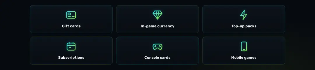
hk-grid columns="3" mobile-columns="2"sets the columns per width.- Each tile has a title, a category handle and an icon (a
selectsetting). - The icons take the shared gradient in CSS:
.arc-tile-icon .ic { stroke: url(#arc-grad); }.
7. How you get your code
<hk-section padding-y="48" mobile-padding-y="32" class="arc-steps">
  <hk-stack gap="24" align="center">
    <hk-heading
      text="{{ section.settings.heading | default: t('steps_heading') }}"
      level="h2"
      size="28"
      mobile-size="20"
      align="center"
      class="arc-h2"
    />
    <ol class="arc-step-list">
      {% render 'step', n: 1, icon: 'pay', title: t('step_1_title'), text: t('step_1_text') %}
      {% render 'step', n: 2, icon: 'mail', title: t('step_2_title'), text: t('step_2_text') %}
      {% render 'step', n: 3, icon: 'trophy', title: t('step_3_title'), text: t('step_3_text') %}
    </ol>
  </hk-stack>
</hk-section>
<hk-schema>
  {
    "name": "How to redeem",
    "version": 1,
    "settings": {
      "heading": {
        "type": "text",
        "label": "Heading (empty = theme text)",
        "default": "",
        "maxLength": 60
      }
    }
  }
</hk-schema><li class="arc-step">
<span class="arc-step-icon">{% render 'icon', name: icon %}</span>
<span class="arc-step-n">{{ n }}</span>
<strong class="arc-step-title">{{ title }}</strong>
<span class="arc-step-text">{{ text }}</span>
</li>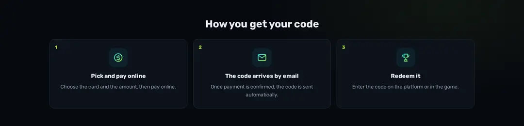
The copy describes what a Hekana digital store does: after an online payment is confirmed, the code is sent by email automatically.
8. Products and questions
<hk-section padding-y="40" mobile-padding-y="28" class="arc-products">
  <hk-stack gap="20">
    <div class="arc-row-head">
      <hk-heading
        text="{{ section.settings.heading | default: t('products_heading') }}"
        level="h2"
        size="28"
        mobile-size="20"
        class="arc-h2"
      />
      <a class="arc-more" href="{{ t('url_products') }}">{{ t('view_all') }}</a>
    </div>
    {% if collection('featured').products %}
      <hk-product-grid
        products="{{ collection('featured').products }}"
        limit="{{ section.settings.count }}"
        columns="4"
        tablet-columns="3"
        mobile-columns="2"
        class="arc-grid"
      />
    {% else %}
      <p class="arc-empty">{{ t('empty_products') }}</p>
    {% endif %}
  </hk-stack>
</hk-section>
<hk-schema>
  {
    "name": "Featured products",
    "version": 1,
    "settings": {
      "heading": {
        "type": "text",
        "label": "Heading (empty = theme text)",
        "default": "",
        "maxLength": 60
      },
      "count": {
        "type": "range",
        "label": "Products",
        "default": 8,
        "min": 2,
        "max": 24,
        "step": 1
      }
    }
  }
</hk-schema>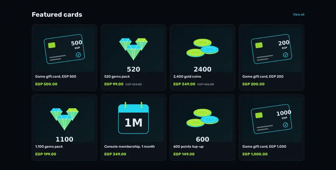
hk-product-grid renders one sn-product-card per product; the stylesheet
styles .arc-grid .sn-product-card, .sn-title and .sn-price.
<hk-section padding-y="48" mobile-padding-y="32" class="arc-faq">
  <div id="faq" class="arc-faq-wrap">
    <hk-heading
      text="{{ section.settings.heading | default: t('faq_heading') }}"
      level="h2"
      size="28"
      mobile-size="20"
      class="arc-h2"
    />
    {% render 'faq-item', q: t('faq_1_q'), a: t('faq_1_a') %}
    {% render 'faq-item', q: t('faq_2_q'), a: t('faq_2_a') %}
    {% render 'faq-item', q: t('faq_3_q'), a: t('faq_3_a') %}
    {% render 'faq-item', q: t('faq_4_q'), a: t('faq_4_a') %}
    {% render 'faq-item', q: t('faq_5_q'), a: t('faq_5_a') %}
  </div>
</hk-section>
<hk-schema>
  {
    "name": "FAQ",
    "version": 1,
    "settings": {
      "heading": {
        "type": "text",
        "label": "Heading (empty = theme text)",
        "default": "",
        "maxLength": 60
      }
    }
  }
</hk-schema>{% if q %}
<details class="arc-faq-item">
<summary>
{{ q }}{% render 'icon', name: 'chevron' %}
</summary>
<p>{{ a }}</p>
</details>
{% endif %}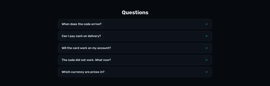
Each question is a <details>: it opens on tap, with no JavaScript. The
questions are about codes and payment, not shipping.
9. Check, preview and push
npx @hekana/sneferu formatindents every file.npx @hekana/sneferu validateprints✔ theme [email protected] is valid.- In
dev, check?locale=enand a window under 640 px. - Change
idintheme.jsonto a slug of your own, thennpx @hekana/sneferu push . --package <your-slug> --dev-store.
Only the home page is rendered by the theme in this release; product, category and cart pages use the store's regular theme.
What to know before you build your own
| Limit | What the three gaming themes do |
|---|---|
| no icon tag | one icon snippet of inline SVG |
asset_url() is empty on the live storefront for now | no bundled images: icons and hero art are inline SVG, product art comes from products |
| no font loader | @font-face rules pointing at https://fonts.gstatic.com |
| one value per setting for every language | text settings default to "", with default: t('…') |
| links do not follow the locale | link paths in the locale files (url_products) |
| template default sections cannot carry blocks | repeated items are numbered settings or locale keys |
a for limit is fixed text | limit: 10; hk-product-grid limit does take a setting |
hk-product-card has no badge or button slot | wrap it: ribbon before, a Buy link after |
| no form inputs and no JavaScript | search is a link; menus and questions use <details>; the Console carousel is scroll-snap with anchor links |